
Book Review - The Art of Still Wakes The Deep
- Aug 19, 2025
- 6 min read
August 19th 2025
Developer The Chinese Room delivered an immersive and creepy hit with Still Wakes The Deep, dropping players on a Scottish oil rig just as things go very, very wrong. The environment, 1970’s time period, and surreal horror designs lend themselves to further exploration in an artbook, which is where Cook & Becker and partner Lost in Cult stepped in.
The Art of Still Wakes The Deep is a look at the development and artwork of the game and is available now on the Cook & Becker website. The 200-page hardcover is now a part of the collection here, so I’ve been able to dive into the book to give you my thoughts on this interesting book.

Build Quality
The copy here is the standard edition of the book, coming as a hardcover with no slipcase. It comes in at 20.5 x 26.5cm with quality pages as you would expect too, although they haven't used gloss paper like most. The cover is interesting in that it features no title, just the image. Perhaps this was just to avoid printing 2 versions of cover, for those with or without the slipcase, but I actually like it this way. Owners will know what it is and the spine does have the title on it, so the book can still be spotted on a bookshelf. The binding is good too, so everything is as you would want it to be.


Content
This is where things were unexpected for me, in both a good and bad way, because it is bordering on an identity crisis. The Art of Still Wakes The Deep is a title I feel should be changed, because while there is art featured in the book, it isn’t the clear focal point. The book is very text heavy, in fact, there are spreads that are nothing but text, or have only one image on them. Although there are plenty of spreads with only art too, ‘The Art of’ comes with a certain expectation in the world of artbooks, this is more in line with ‘The Art and Making of’ or simply ‘The Making of’, it's even akin to Lost in Cult’s Design Work series.
There is nothing wrong with this approach, in fact it was a joy to read through the book, it’s wonderfully written and incredibly engaging as a fan of not just the game, but also as someone with an interest in the industry as a whole. Author Lewis Packwood has done a superb job at making game development an accessible read, as well as getting a wealth of wonderful insights from the development teams and artists themselves.
It’s worth pointing out what one should expect with the book though, as artbooks are incredibly varied and can come with no text, brief descriptions, paragraphs of insights, a focus on the art, development deep dives, only concept art, some graphic design, and so on. While there is a good amount of concept art in the book, as well as graphic design inclusions for the posters and logos too, it comes mostly separated from the large amount of text, making this very much a hybrid book. One chapter is 4 pages of text with just one image, a couple of others don’t include much more, highlighting it’s not strictly an artbook as some may expect.


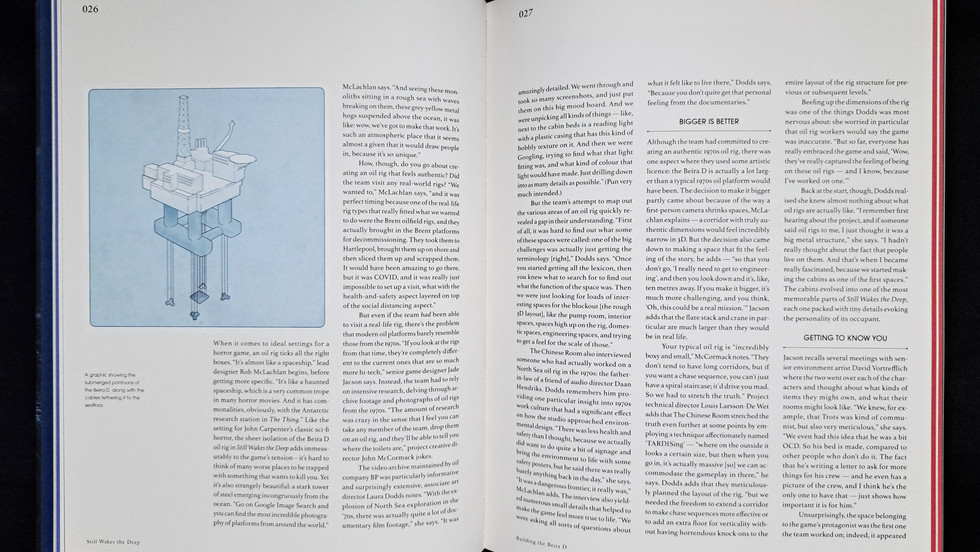
The Art of Still Wakes The Deep features around 200 images across as many pages, which averages about one per page. This includes concept art, storyboards, photos, screenshots, and graphic design, with the concepts making up most of the count. It’s not as much as expected, but I do like what you get here, with a lot of very strange and surreal concepts of the ‘goop’, enemies and environments. Beira D, the oil rig the game takes place on, was a great setting for the horror game, so seeing how the artists depicted it throughout the game’s events is a highlight. Another being the designs of the ‘puppets’, the enemies of Still Wakes The Deep, shown in grotesque, strange, and often horrific forms.
The chapter titled ‘Unknowable Horror’ has a lot of art, with 16 spreads of artwork and 3D models for the unknown creature and the transformed crew members. This will no doubt be a favourite section for many, with wonderfully gruesome designs from the team, as well as revealing details about their creation.
An unfortunate note on the art though, is that images in the book appear dark in places, sometimes obscuring details that can be seen online. This is a real shame, especially as the colour of the game and art really shines with its contrast of darkness and areas of otherworldly pinks, purples, greens, and blues. It doesn't affect every piece, but some have less pop than they do on screen. You can see an example below with art from Jordan Grimmer.


The team at The Chinese Room was very open about the making of the game, including many details about ideas that were tested and not used, often the best part of any book. Not only do they describe in detail what they planned and tried, but they show the concept art too. The team share details on exploring a water based creature, working with the strange lifeform, alternate endings, character development, adding features inspired by glitches, and more. It’s a fascinating read that benefits from the sketches and concept art that showcases what they left on the cutting room floor.
As well as this, you can read about the original inception, reasons for choosing the 1970’s time period, casting the characters, creating the music, development issues, design choices (including infamous industry yellow paint), marketing, game testing, inspirations, and more. It covers everything and that makes this the perfect book for fans of the game wanting to know more about its development.
Credits
Artist credits are sadly lacking throughout which is a shame. A handful of pieces credit Atomhawk for the work, although they are an art studio, so it doesn’t quite give the full credit to an individual. The only person to get a chance to shine is Jeff Wall for his 3D models of enemies and bodies. The vast majority of the art receives only a brief description.
Use of Space
This is unfortunately a bit of a let down for me, as there is a lot of unused space. On the pages of text, pages are filled as you can see in the previews, the problem for me personally comes with the art pages. As you may have noticed, the images don’t take up the full page, a lot of space is left empty and there is certainly room to enlarge the images to take up some more of this. While I don’t mind a minimalist approach to page design, when the art can be given more room to shine, it always should. By implementing a larger header and footer, as well as keeping the art away from the edges of the page, it becomes restrictive.
This is made a little more disappointing because in a preview for the book—of course subject to change but still on the publisher website— they show an image that goes from page edge to page edge, but this is not present here. In fact, it’s a really nice piece of art too, but this was also not found in the final release. You can see this preview below, as well as how the book presents a larger image.


It feels as though this, along with the Chapter titles taking up 2 pages with a simple small description, has limited the number of pieces of artwork and 3D models the book could have included. It’s hard to know how much more art was made for the game, but short of adding more, the pieces included could have been in a larger format. Mixing the art amongst the text throughout may have been a great way to balance the content and presentation.
Value
The book can only be ordered through the Cook & Becker website with a price of $49.95 (£37) excluding shipping, which is standard pricing for an artbook. This is a reasonable price, so nothing out of the ordinary here, but if this is worth the price will ultimately come down to whether you are after a comprehensive deep dive into the making of Still Wakes The Deep, or if you want a more traditional artbook.


Verdict
The Art of Still Wakes The Deep is as strange as the organism that takes over Beira D, as it’s odd in its presentation. It joined the collection with the expectation it would be a more typical ‘Art of’ book, with art and insights mixed together throughout. Where it shines is as a ‘Making of’ book, expertly written and engaging throughout. However, as an artbook, it ultimately falls short with less art than expected, sizing issues and dark prints.
It’s a tough to speak negatively on the book, because I actually really enjoyed reading it, but this is an artbook review and it's only fair to review it as one. If you are buying this primarily for the art as a fan of the the game or artbooks in general, you may be left disappointed. Those wanting a good read on the game development will have a much more positive experience.
If you're someone that loved the game and want to know more about its development along with seeing the concept art, you can order The Art of Still Wakes The Deep from the Cook & Becker website here;


